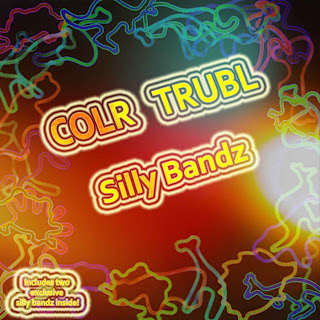
This is where i'll be logging all my steps in to creating my CD Cover for COLR TRUBL.
Firstly i began to look for the actual dimensions to what a CD Cover actually is.
I found this site :
http://www.canadianmusicartists.com/coverdesign.html which showed me that a front cover is 12cm - 12cm and a back is 11.75cm -15.1cm.
I am going to create my CD Cover design in Adobe Photoshop.
Using the 12 + 12 cm dimentions, i started my work.
Here is what it looks like to begin with.
Now to add the images. I chose some images which i wanted to use for my CD Cover. Here are the images that i chose to begin with.
The first image i did myself in which i had the slillybands. I got a lamp to put it underneith a piece of paper sitting on a makeshift light up base with them arranged over it. It made them stand out better.
The second image i got off the internet.
Firstly i had to insert the image that i had chosen to put onto my CD Cover. I chose this one of sillybandz all placed around in a circle.
As you can see the image is huge but thats a good thing as the image will look better when it is smaller.
ctrl +c it into your 12 by 12 cm cd cover but look its very big! like i said earlier the bigger the better. Press ctrl + T and transform it to the required size that you would like it to be.
Now that layer of your image is at the required size that you want it, you will need to create a copy layer as if you edit this one too many times and dont like it, it can be a pain to undo it all.
Left click the layer and place the "hand" onto the symbol to the right, which is next to the bin in the right hand corner. Like below.
This is the layer than you can have fun with and try out all the different blends.
I eventually chose the Exclusion blend which i really liked.
I also did this with the other image that i wanted to add extra colour to the front.
Left click the layer and place the "hand" onto the symbol to the right, which is next to the bin in the right hand corner and used the copied layer to do all your blends. I chose screen for this one as it shows up really well with my other image.
Now i am going to add the name of the band and the name of the single.
Firstly i started with the name of the band, rotated it a bit and made the primary colour yellow.
I would like this to stay as it is, but i would like it to blend in with the background of the CD cover style.
For the effect i wanted, i chose the Vivid Light blend which blends the letters to the style of the background.
Then i thought "hmm wouldnt it look better rotated the other way?" so i decided to rotate the band name to make it look like this:
I also added a "Double Ring Glow" around the words to make it stand out using the "styles".
I am now going to add the name of the album to my CD Cover using the same technique.
I started off with just a plain old name like this.
Then roated it to look the same as the other text. using the "Vivid Glow" blend and then adding the "Double Ring Glow" around the words to make it stand out using the "styles" tool.
So it looks like this.
I then found out that the words "COLR" and "TRUBL" were too close together, then it looked like it was 1 word. So i used the text tool and added a few spaces.
The same also applied to the bottom left hand corner in which it has the "Free exclusive sillybandz" inside which can be seen below.
And here is my finished CD Cover.


