Tuesday 7 December 2010

My Poster for COLR TRUBL

This is where i am going to create my poster for COLR TRUBL using INDESIGN and Photoshop. Here is how i did it.

INDESIGN is a compression software in which i takes all of the graphics i have saved from photoshop and adds them together to create a collabrative piece of work.

Firstly i opened up Adobe INDESIGN and created a new document. I changed it to an A3 Page so that if i wanted to make the poster bigger, i can without messing up the graphics and making them all pixelized.


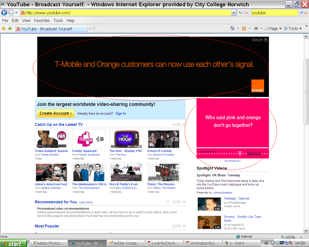
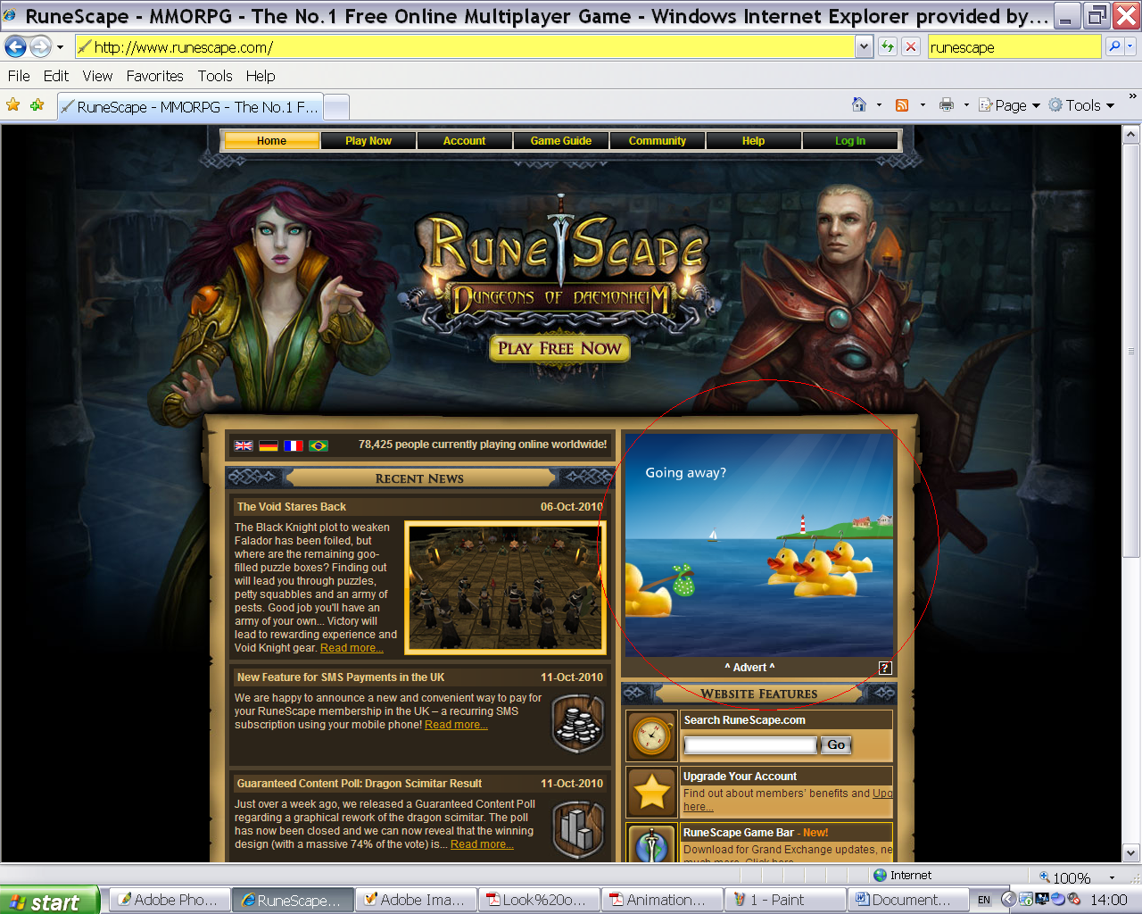
To find a high quality JPEG you must look at the image you are hunting for, then check the resolution. Anything higher than 2 mega pixel is good.
The higher the resolution, the better the image quality is.
In this picture it is underlined in Red.


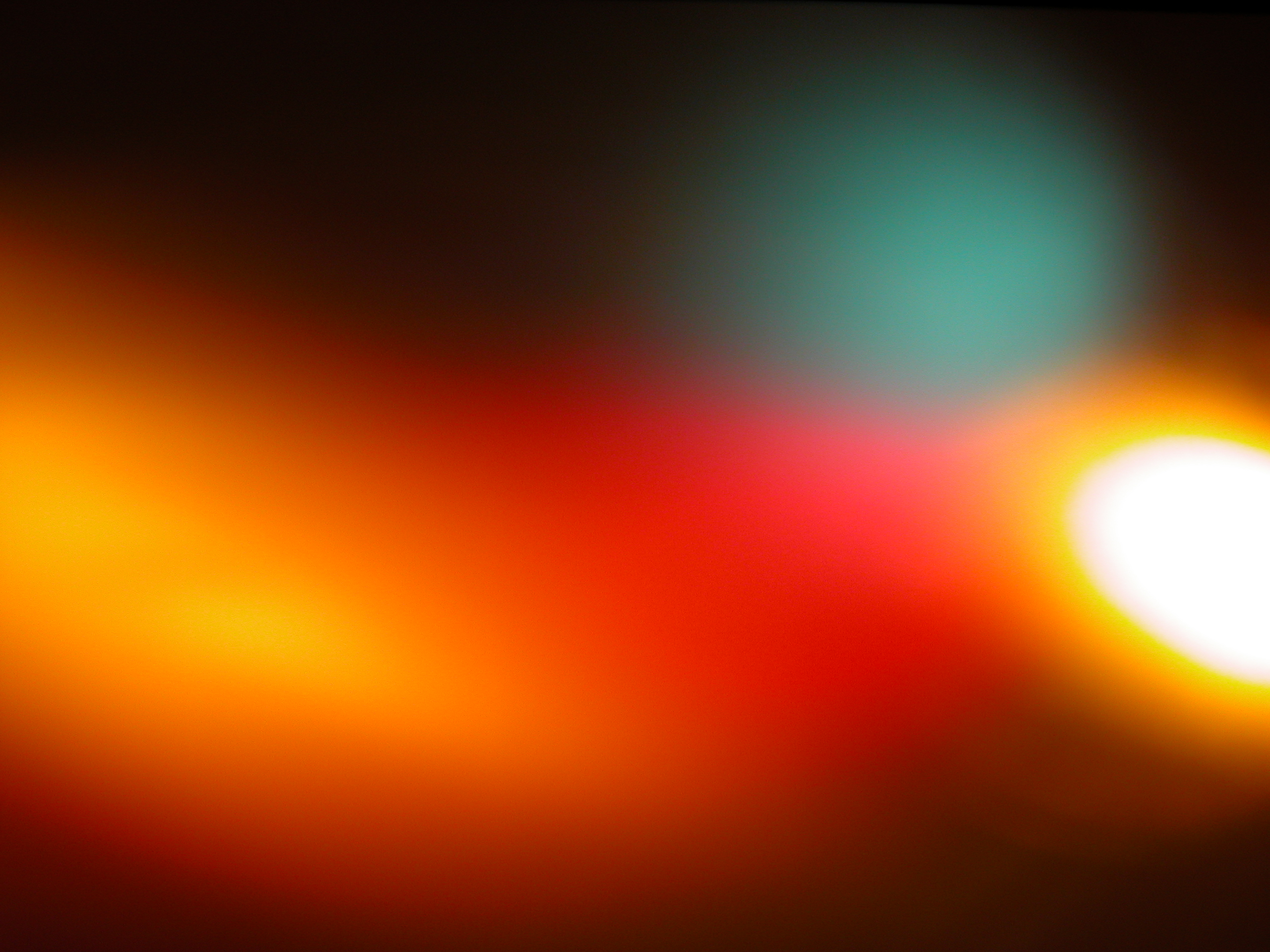
I then went into Photoshop and started with the background using these two images.

The first image i found on the internet in which i found a high quality JPEG file so that it can be enlarged and not loose its quality.


The second image i made by myself with a 3 megapixel camera and a lamp underneith to make it look more vibrant and bold.
Firstly i opened the two images side by side each other, and then rotated the blurry lights image so that its Portrait like my other image that i made myself.


(WARNING: Create a second  background image and put it on the "Exclusion" blend tool first!)

I then copied and placed the image onto my other image like so:


The image is smaller than the other image to begin with but if you transform it (CTRL + T) to make it bigger so that it overlaps the whole image.


Then i did the same thing in which i chose the screen blend tool to make it match my CD Cover.


I then saved it as a normal photoshop file (PSD file) cant just be copied and pasted into INDESIGN. I then placed it into my INDESIGN document after creating a new layer and naming it "Background".


After i placed the image into place, i transaformed it a little so that it fitted in my margin lines.

I then created a layer called "image" and placed my image into place by rotating it and making it smaller.


I then created a "Title and Subtitle" layer to when i am going to all my Title and Subtitle to the top of the poster.

Back to photoshop, i created another document and made it transparent.
After that i chose my desired syle (refer to CD Cover post) and then saved it.
As i cant just copy and paste this actual piece into INDESIGN sadly, (Like i said earlier) so each piece has to be saved and then placed into INDESIGN as you can see below.


Above is the Document in which you create your transparent titles  - Save them as a photoshop document and then place them into your INDESIGN poster. File -> Place.


Here is how it looks after 3 titles have been added (above) and below is the version with the same steps being taken over and over to create different titles.

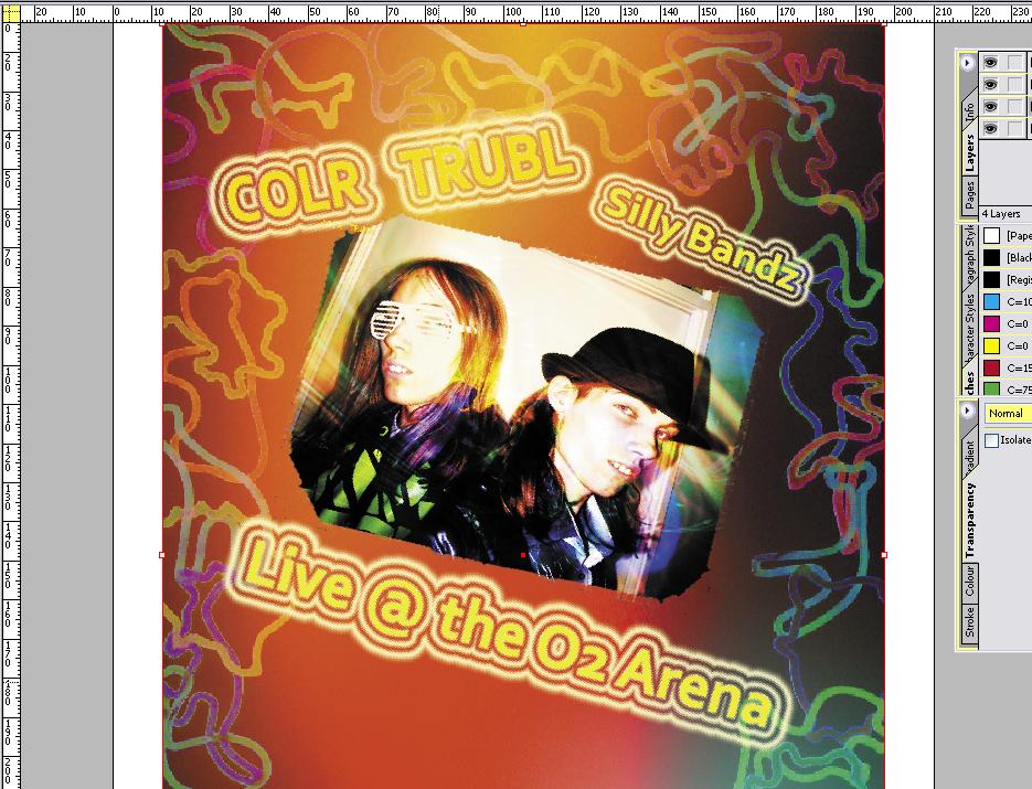
And here is the finished product below.


Tuesday 30 November 2010

Poster Research.

Today i researched various posters in which i wanted mine to slightly look like. Here are a few that i found that were appealing to what i wanted mine to look like and the general feel of a decent poster.

I wanted my poster for COLR TRUBL to make it look like they are having a show in the near future and that people can book tickets to see it. I wanted it to be in the O2 Arena as thats a preety popular place for music shows.

It has to include: Title, Name of band, date,time,place,contact info, alot of colour, and some images. (maybe some sponsors?)

Here is my drawn version of how i want the layout to look like in which i think my design will look like when creating in INDESIGN:


And thats my research. I may change my poster to how it progresses through the stages. Now i can start making the poster itself.


Tuesday 23 November 2010

CD Cover Research

I researched various CD Covers in which i wanted to relate to mine.

The one in which i examined alot in to which i wanted mine to look like, was the Pop Party CDs but to keep the style to my drawn idea.


The style in which they are colourful and that the Logo changes but keeps the same style of font through every single album.
I also like that they sometimes give an extra bonus Karioke CD but i have instead given my Ablum free Items in which people can wear and others can say "where did you get that!?"
It also attracts the younger audience and makes parents want to buy it.

Tuesday 9 November 2010

Something i made at home for COLR TRUBL poster.

Im just classing this as an "image" because i cant really remember how i actually did it all. It wasnt done on Industry standard software but SERIF Photoplus.


Lol! unpon further inspection i noticed the letters in the bottom left corner. OH WELL! i still like it.


Enjoy

Adam

Tuesday 2 November 2010

CD Cover


This is where i'll be logging all my steps in to creating my CD Cover for COLR TRUBL.

Firstly i began to look for the actual dimensions to what a CD Cover actually is.
I found this site : http://www.canadianmusicartists.com/coverdesign.html which showed me that a front cover is 12cm - 12cm and a back is 11.75cm -15.1cm.


I am going to create my CD Cover design  in Adobe Photoshop.

Using the 12 + 12 cm  dimentions, i started my work.


Here is what it looks like to begin with.


Now to add the images. I chose some images which i wanted to use for my CD Cover. Here are the images that i chose to begin with.

The first image i did myself in which i had the slillybands. I got a lamp to put it underneith a piece of paper sitting on a makeshift light up base with them arranged over it. It made them stand out better.
The second image i got off the internet.

Firstly i had to insert the image that i had chosen to put onto my CD Cover. I chose this one of sillybandz all placed around in a circle.


As you can see the image is huge but thats a good thing as the image will look better when it is smaller.


ctrl +c it into your 12 by 12 cm cd cover but look its very big! like i said earlier the bigger the better. Press ctrl + T and transform it to the required size that you would like it to be.

Now that layer of your image is at the required size that you want it, you will need to create a copy layer as if you edit this one too many times and dont like it, it can be a pain to undo it all.
Left click the layer and  place the "hand" onto the symbol to the right, which is next to the bin in the right hand corner. Like below.


This is the layer than you can have fun with and try out all the different blends.  
I eventually chose the Exclusion blend which i really liked.

I also did this with the other image that i wanted to add extra colour to the front.


Left click the layer and  place the "hand" onto the symbol to the right, which is next to the bin in the right hand corner and used the copied layer to do all your blends. I chose screen for this one as it shows up really well with my other image.

Now i am going to add the name of the band and the name of the single.

Firstly i started with the name of the band, rotated it a bit and made the primary colour yellow.

I would like this to stay as it is, but i would like it to blend in with the background of the CD cover style.

For the effect i wanted, i chose the Vivid Light blend which blends the letters to the style of the background.


Then i thought "hmm wouldnt it look better rotated the other way?" so i decided to rotate the band name to make it look like this:


I also added a "Double Ring Glow" around the words to make it stand out using the "styles".


I am now going to add the name of the album to my CD Cover using the same technique.


I started off with just a plain old name like this.

Then roated it to look the same as the other text. using the "Vivid Glow" blend and then adding the "Double Ring Glow" around the words to make it stand out using the "styles" tool.


So it looks like this.

I then found out that the words "COLR" and "TRUBL" were too close together, then it looked like it was 1 word. So i used the text tool and added a few spaces.

The same also applied to the bottom left hand corner in which it has the "Free exclusive sillybandz" inside which can be seen  below.


And here is my finished CD Cover.


My Fake Band Idea.

For our assignment, we have to create a Fake Band and produce two products to promote the band.

Here's a clue to who i chose to kind of create a spoof of, instead  making them a pop duo.....
WHO COULD THEY BE!?


Anyway, here is my Biography of my fake Band COLR TRUBL in which i am going to create a CD Cover and Poster for.


And here are some CD Cover Ideas:


enjoy

Adam

http://en.wikipedia.org/wiki/Jedward

Tuesday 12 October 2010

Making A Web Band/Banner Thing

12/10/2010


Today we had to create a Web Banner that had to advertise http://www.postsecret.com/ but we could use the things off  our Postcards we made in introduction week as well.

I concentrated primarily on the Sun and Rain from my postcard and added a few things that represented me but wanted it to be small, so I chose the Implings from Runescape and intergrated them with my other pictures.

First we had to research various websites with banners on them. Here are websites that I use regularly that have Web Banners on them:


I chose to use a http://www.newgrounds.com/ banner which can be seen here:


I made a new document in Photoshop and it had the exact dimensions of what it was, then I was all set to get creating my Web Banner.


 Here are some various pictures that I used, mostly the little Implings.


I gave my WebBanner a cloudy background and locked the layer. Then I added the sun and the rain on the other side of where they were going to finish, I then made a layer each time and moved it once, then made another layer and so on. I also did the same thing with the Imps.


For the "Post Secret" logo I right clicked on it and it came up with this "Bevel and Emboss" I used this piece if software to make it  look all crumply and than appear as if it was a secret.


I then went into Adobe Imageready and with the layers I made I created my Animated Web Banner (making the layers that were not being used invisible so that the layers that are visible with the same image do not overlap.)


Eventually I created my Web Banner in Imageready. Here is the information about it:

And here is my final Web Banner, all working and animated:


Enjoy

Adam

PS: Here is my postcard that I made in introduction week based on PostSecret Cards:


GIF - (Graphics Interchange Format) is a bitmap image format for pictures.  GIF files employs lossless data compression so that the file size of an image may be reduced without degrading the visual quality. It cant be used for photographs and is popular in creation web logos and any pictures/images with 256 colours.


Software Used - Adobe Photoshop
Image Ready

The favourite tools that I used in these were the adding layers and Bevel and Emboss which I had found by accident.