Tuesday, 2 November 2010

CD Cover


This is where i'll be logging all my steps in to creating my CD Cover for COLR TRUBL.

Firstly i began to look for the actual dimensions to what a CD Cover actually is.
I found this site : http://www.canadianmusicartists.com/coverdesign.html which showed me that a front cover is 12cm - 12cm and a back is 11.75cm -15.1cm.


I am going to create my CD Cover design  in Adobe Photoshop.

Using the 12 + 12 cm  dimentions, i started my work.


Here is what it looks like to begin with.


Now to add the images. I chose some images which i wanted to use for my CD Cover. Here are the images that i chose to begin with.

The first image i did myself in which i had the slillybands. I got a lamp to put it underneith a piece of paper sitting on a makeshift light up base with them arranged over it. It made them stand out better.
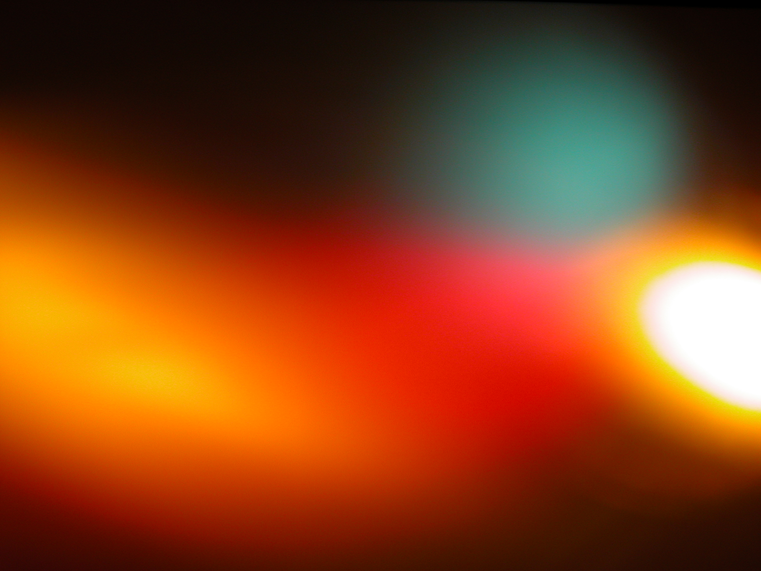
The second image i got off the internet.

Firstly i had to insert the image that i had chosen to put onto my CD Cover. I chose this one of sillybandz all placed around in a circle.


As you can see the image is huge but thats a good thing as the image will look better when it is smaller.


ctrl +c it into your 12 by 12 cm cd cover but look its very big! like i said earlier the bigger the better. Press ctrl + T and transform it to the required size that you would like it to be.

Now that layer of your image is at the required size that you want it, you will need to create a copy layer as if you edit this one too many times and dont like it, it can be a pain to undo it all.
Left click the layer and  place the "hand" onto the symbol to the right, which is next to the bin in the right hand corner. Like below.


This is the layer than you can have fun with and try out all the different blends.  
I eventually chose the Exclusion blend which i really liked.

I also did this with the other image that i wanted to add extra colour to the front.


Left click the layer and  place the "hand" onto the symbol to the right, which is next to the bin in the right hand corner and used the copied layer to do all your blends. I chose screen for this one as it shows up really well with my other image.

Now i am going to add the name of the band and the name of the single.

Firstly i started with the name of the band, rotated it a bit and made the primary colour yellow.

I would like this to stay as it is, but i would like it to blend in with the background of the CD cover style.

For the effect i wanted, i chose the Vivid Light blend which blends the letters to the style of the background.


Then i thought "hmm wouldnt it look better rotated the other way?" so i decided to rotate the band name to make it look like this:


I also added a "Double Ring Glow" around the words to make it stand out using the "styles".


I am now going to add the name of the album to my CD Cover using the same technique.


I started off with just a plain old name like this.

Then roated it to look the same as the other text. using the "Vivid Glow" blend and then adding the "Double Ring Glow" around the words to make it stand out using the "styles" tool.


So it looks like this.

I then found out that the words "COLR" and "TRUBL" were too close together, then it looked like it was 1 word. So i used the text tool and added a few spaces.

The same also applied to the bottom left hand corner in which it has the "Free exclusive sillybandz" inside which can be seen  below.


And here is my finished CD Cover.


My Fake Band Idea.

For our assignment, we have to create a Fake Band and produce two products to promote the band.

Here's a clue to who i chose to kind of create a spoof of, instead  making them a pop duo.....
WHO COULD THEY BE!?


Anyway, here is my Biography of my fake Band COLR TRUBL in which i am going to create a CD Cover and Poster for.


And here are some CD Cover Ideas:


enjoy

Adam

http://en.wikipedia.org/wiki/Jedward

Tuesday, 12 October 2010

Making A Web Band/Banner Thing

12/10/2010


Today we had to create a Web Banner that had to advertise http://www.postsecret.com/ but we could use the things off  our Postcards we made in introduction week as well.

I concentrated primarily on the Sun and Rain from my postcard and added a few things that represented me but wanted it to be small, so I chose the Implings from Runescape and intergrated them with my other pictures.

First we had to research various websites with banners on them. Here are websites that I use regularly that have Web Banners on them:


I chose to use a http://www.newgrounds.com/ banner which can be seen here:


I made a new document in Photoshop and it had the exact dimensions of what it was, then I was all set to get creating my Web Banner.


 Here are some various pictures that I used, mostly the little Implings.


I gave my WebBanner a cloudy background and locked the layer. Then I added the sun and the rain on the other side of where they were going to finish, I then made a layer each time and moved it once, then made another layer and so on. I also did the same thing with the Imps.


For the "Post Secret" logo I right clicked on it and it came up with this "Bevel and Emboss" I used this piece if software to make it  look all crumply and than appear as if it was a secret.


I then went into Adobe Imageready and with the layers I made I created my Animated Web Banner (making the layers that were not being used invisible so that the layers that are visible with the same image do not overlap.)


Eventually I created my Web Banner in Imageready. Here is the information about it:

And here is my final Web Banner, all working and animated:


Enjoy

Adam

PS: Here is my postcard that I made in introduction week based on PostSecret Cards:


GIF - (Graphics Interchange Format) is a bitmap image format for pictures.  GIF files employs lossless data compression so that the file size of an image may be reduced without degrading the visual quality. It cant be used for photographs and is popular in creation web logos and any pictures/images with 256 colours.


Software Used - Adobe Photoshop
Image Ready

The favourite tools that I used in these were the adding layers and Bevel and Emboss which I had found by accident.

Tuesday, 5 October 2010

I Completely forgot to add this! Animal Faces Work

Here is my funny animal face work I made in INDESIGN the second week at college, using a photo of a squirell and Owens face which I used as the final image in my Newspaper Cover work.

Orignal Photo


Owens Face
+ me playing in INDESIGN - heres how I did it -

Firstly I used the clone tool to remove the eyes of the squirell, then I put Owens face next to it, ready to add eyes.

Then I cut around Owens eyes using the Laso Tool like so:

I then added them to my squirell picture. I faded them out a little so that they did not look like they were taken from something else.
I also erased some of the little bits of Owen's skin using the Eraser Tool from around the eye and here is the photo of the eyes.
= my final picture.
LOL! Hyperactive Squirell YAY!


Adam

Other Bits I did in that lesson:

PSD – A document in Photoshop you can still edit and come back to and change over time. (Photoshop Document is its real name)


JPEG – Join Photographic Experts Group – Used to make huge image files into a small file size. Compresses files by 90% - 1/10 0f its original size. Its is mostly used in websites.

My Newspaper Cover!

5/10/10

Before


After! :o!


This was actually a quite fun lesson in the end. I completed the work I was set out and learned INDESIGN very well. (It was a whole new piece of software to what I am used to).  There is one problem with my final piece (but Adam, it looks so real!!!! You could work for the EDP!) Well, the logo for "EASTERN DAILY PRESS" was not as big in size/format that when I zoomed in on it, it was very pixelized. But when I printed it out on A4 it looked ok so i was happy with it..

The actual logo I used:


(UPDATE - As my exported copy (which shows a lot of detail) did not show up the really great article I had put together, as it is really small like normal newspapers, I have supplied a zoomed in version below):


Adam

Random Hint: I am keeping a diary (only small) of what I did in that lesson/lessons and updating it everytime. It is in the middle of my desktop so I always notice it.

Newspaper Research!

28/9/10

For our lesson we had to research various newspapers so that we could create our own newspaper in INDESIGN (I think that is what it is called). I researched various newspapers. here are a few:


I chose the EDP as the newspaper I was going to put my Hyperactive Squirell  Picture in that I had made onto the front page as it is clearly set out with loads of information so you know what page has the information you are looking for and it is one I regularly read.

The scanned image above is my first atempt to how I was going to set out my version of the newspaper. It was changed,and changed, AND CHANGED, many times because my picture is portrait. Eventually I decided to keep it the way it is but add my own content: Shown below.

I might not always do these scanned images as I would rather hand in my sketchbook at the end as its shows them at their full potential. But hey! hopefully this is ok to show you some of my work in lesson until I hand my SB in.


Adam